Day 18: The power of persuasion...runs in the family
I have to say it, my little brother is by far one of the coolest kids I know! Brandon sent me his final for whatever CGD218 stands for…contextually I gather that it is some sort of intro to Typography and Design for business majors. I will let you read it in its entirety before I offer my astute commentary.
Vintage Future
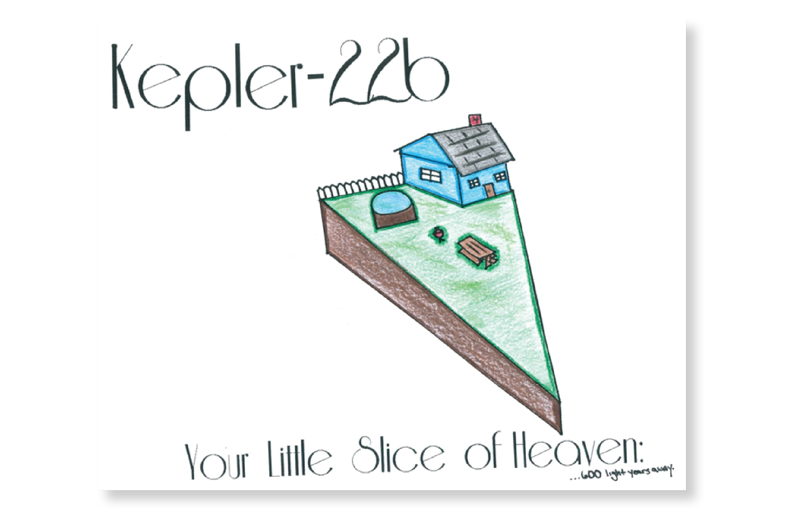
A look at the past can provide a glimpse into the future. Vintage American themes are reminders of yesteryear. These classic images take one back to the days of invention, and the true American dreams. The white picket fence dreams of keeping up with Mr. and Mrs. Jones. These icons are expressed through typography, color, and image grouping. These aspects of an image are subtle, but quite significant when seeing an image.
The art of typography is the implications of text in an image. The text must be contextually significant to the image. The other aspect of typography that must be acknowledged is the delicate placement of the text so that it is not too distracting. “Type delivers the message and meaning, the tone of voice and feeling, and an explanation of the ad’s importance” (White 2006, pg.140, para.2). The use of typography in this image frames the idea in a classic idea. The font name is called Riesling font. When searching through ads of the 1950s I came across the eye appealing font that drew me back to a much simpler time. The font set a theme around the iconic vintage American image. This font leads the viewer from the top left corner over the image to the bottom right hand corner; this engages the viewer to see the image as a whole compared to font and an image.
The coloring was important to this image. “Color not only enhance the appearance of an item—they also influence our behavior…you will do well to consider the impact that the colors you use will have on a target audience” (Campbell 2008, para.2). The color blue was chosen because through research the color blue was the second most popular house color. While the color white is the overwhelming front runner in house color having a white home would take away from the pop of the white picket fence. The calming blues and aqua used in the pool were chosen to signify the purity and calm of an ocean blue. The use of blues according to Campbell (2008) “the color blue expresses trust, reliability, and belonging” (para.9). The inviting color used twice is relevant when appealing to the viewer. The freshly cut, well kept, and green grass is a common status symbol of an American home. The colors were chosen to create an attractive property as if it were a picture in a reality advertisement.
The image groupings go hand-in-hand with the typography and color selection. As mentioned previously the framing provided by the font ensure an untied image as a whole. The color selection from the white of the fence, the blue of the home, and the green of the grass tie the American dream of property ownership together. These images could not express a theme by themselves, but together set on a plot of land cut in the shape of a slice of pie all express the American dream of yesteryear. The iconic apple pie is as true to American history as the white picket fence dreams of every person. The subtle shape of the land plot and the power of suggestion through font incorporate as much of the vintage American icons as one can. The idea of a simpler time draws the viewer into a blissful idea of change.
This significant thought between incorporating type font, coloring, and image grouping are significant to consider when putting an image together. The subtle approach to the use of font can be the lynchpin for an image. Considering color choice can have a direct impact on the viewer, and could be more than just attractiveness. The grouping of images together has significant meaning as a whole.
So… I went to art school, so I am professionally trained in bull shitting about Chiaroscuro, but this kid nails it! I love that he just goes for it. I mean he researched the most popular house color, and then justified not using it. I have always wished that he would pick up on some of my ridiculous/awesome character traits…like being able to tell almost anyone to “suck it” and get away with it…and I think he has!
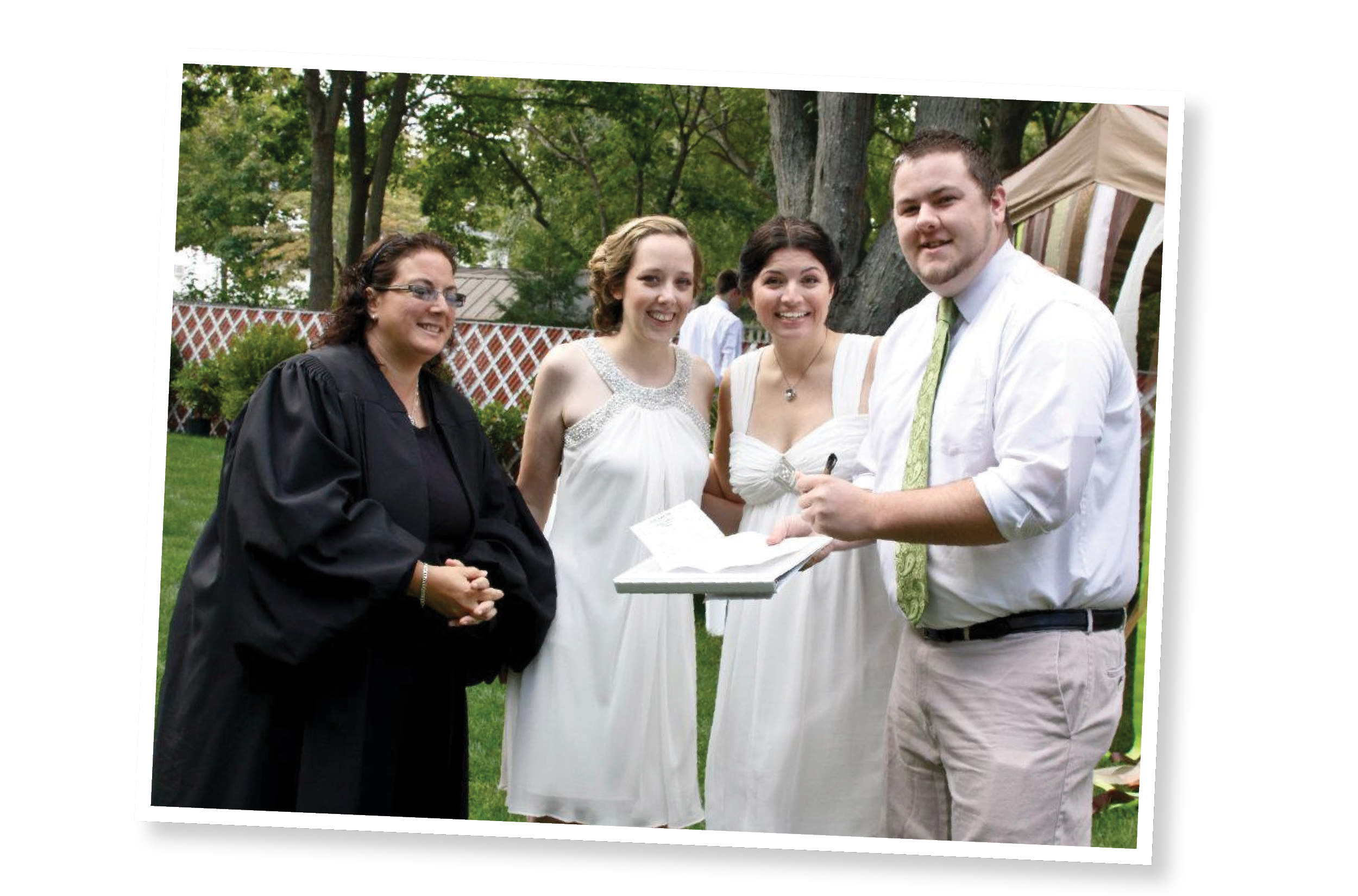
I am so lucky to have such an awesome little brother. He was the best man at my wedding, and gave a fantastic speech (which was written on the back of a page from the hospitality book in his hotel room). Watching him, Danna, and Mark stand up for us and speak so eloquently was such an amazing experience because for the first time I saw all three as real live grown-ups. I am so proud of all three of my siblings, and am lucky to have so much love!
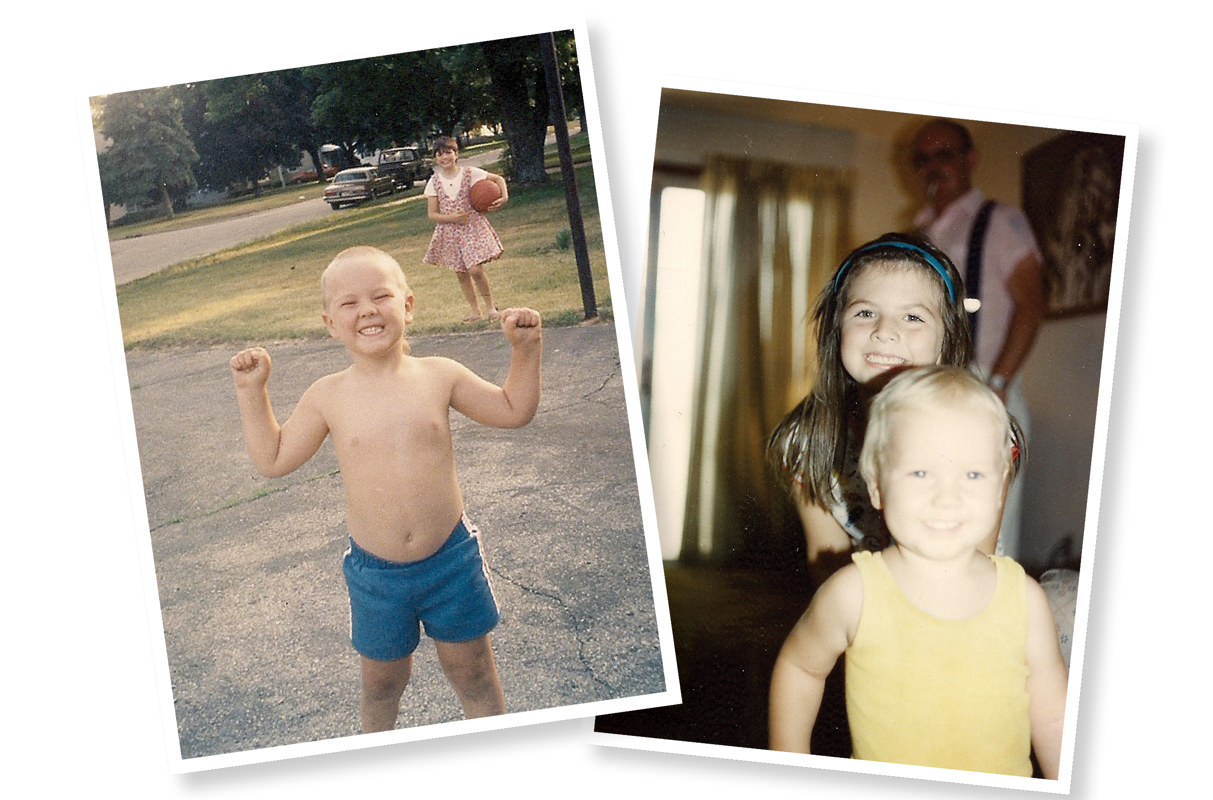
I am four years older than Brandon, which actually made us really close as kids. We had the perfect age gap, gender, and birth order alignment to just naturally get along. On top of that I left for college so early that we didn’t really have a chance to be obnoxious teenagers together.
When I got my first job doing design and research the kid would call me at midnight and be like “DUUUUUUUDE, I know what we should make…how about soda that comes in mix packs? Or, or, or, what about sheets of paper that you put over the toilet seat so that you don’t have to touch the toilet seat” Buddy…both of those things exist and I am working at a power tool company…what I am supposed to do with that?
Brandon is one of the strongest people I have ever met, and if you met him you would never guess it. He is so happy, sassy, and fun to be around, but he has overcome so much. When he was in high-school he was a great student and taking college level classes, until he was in a life changing car accident. He was in a comma, had to be medivac-ed, and ended up incurring minor brain-damage which led to a loss of taste, smell, and short term memory. For a while no one was sure if he would bounce back. Relearning how to learn when you are 16 is a pretty tall order, but Brandon has rocked it. He is in school pursuing a business degree, working full time as a hotel manager, and is so smart and funny. He took an event that could have negatively affected the rest of his life; grabbed a dry erase marker to keep track of all of the things he had to remember and told the world to suck it!
Do you have a family member who inspires and encourages you? Tell them you love them!
 Beth Werner |
Reader Comments (1)
Here is the response I got with regards to this assignment from my teacher. I got a 29/30 on the project.
"This is a good paper! It is well written and correctly formatted. The exact message you wanted to communicate is a bit unclear. Is vintage better? Do you want to go back to “the good old days?” The message could go in several different directions. Nevertheless you did a good job explaining how you would use color, shape and other design elements to visually communicate a message."