Thursday
Nov292012
Medical Record Design
Allison and I are entering a contest for medical record design and would love your feedback!
Here is the original record

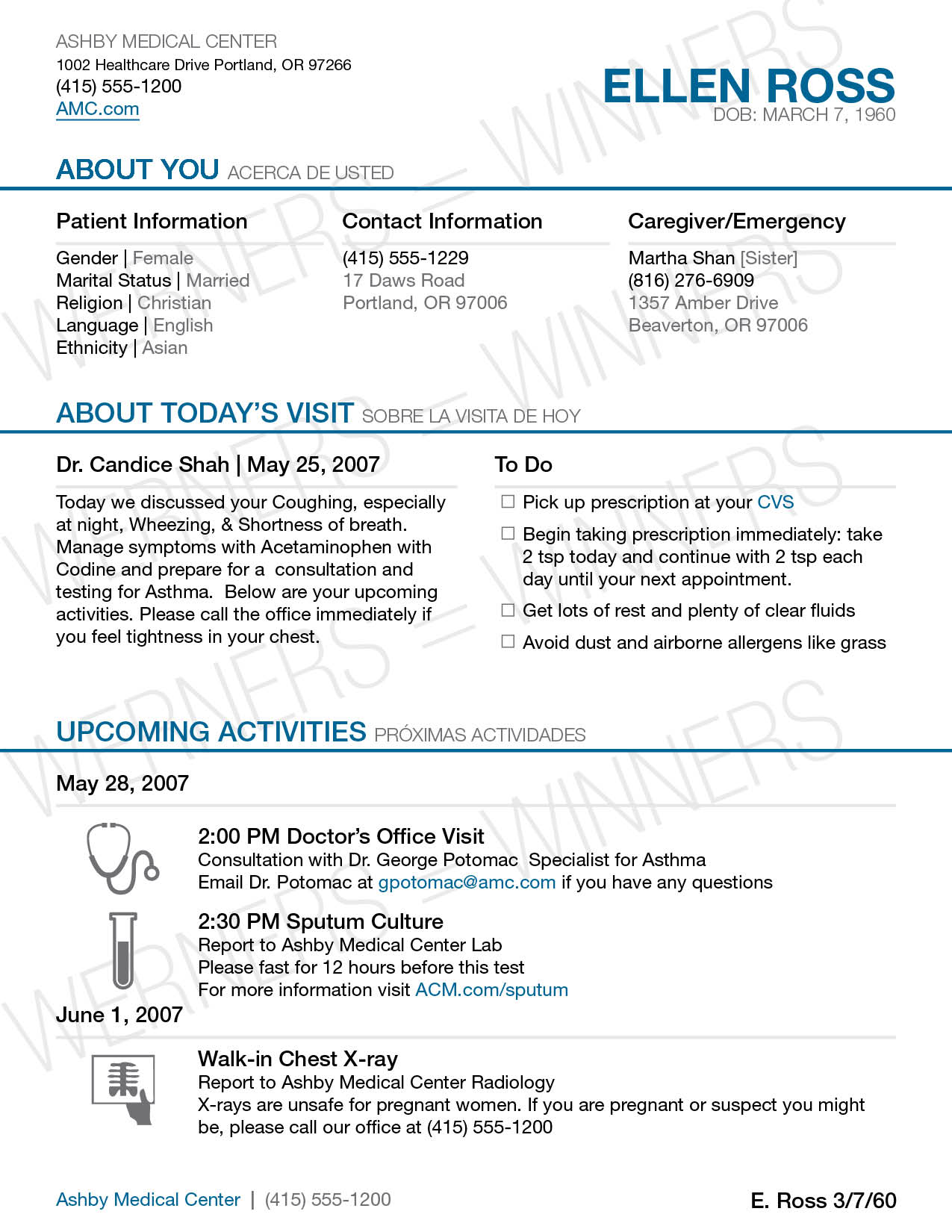
Here is our design.
Page 1

Page 2

Page 3

Page 4

Page 5 version 1
 Page 5 version 2
 Page 6 version 1
 Page 6 version 2

What do you guys think? What would you change? What would you add?
 Beth Werner |
  Thursday, November 29, 2012 at 10:34PM
Reader Comments (5)
Very informative and easy to read. Are you keeping version I & version 2 ? I like version 2's better.
We are going to pick one for labs and one for medications. Did you prefer version 2 on both?
Love the format overall.
I think there needs to be more information on the medication portion. Like if you experience X symptoms, dial 911 now. If you experience X symptoms, call your doctor. What about drug interactions if you take both at the same time? Like 'don't take with alcohol' or 'don't eat grapefruit.'
Also, why are only the titles in Spanish but not anything else?
I get all my vitals (temperature, blood pressure, pulse, weight, etc.) on my print out though I would prefer not to see things on there like weight :)
I like version 1 of both pages better. Reason for medication page is that patient may get confused if actual prescribed medicine looks different than medication that is dispensed. Is the doctor giving this paper work, or the pharmacy? Love the overall simplicity, all information readily available and easy to read.
Both version ones better :)